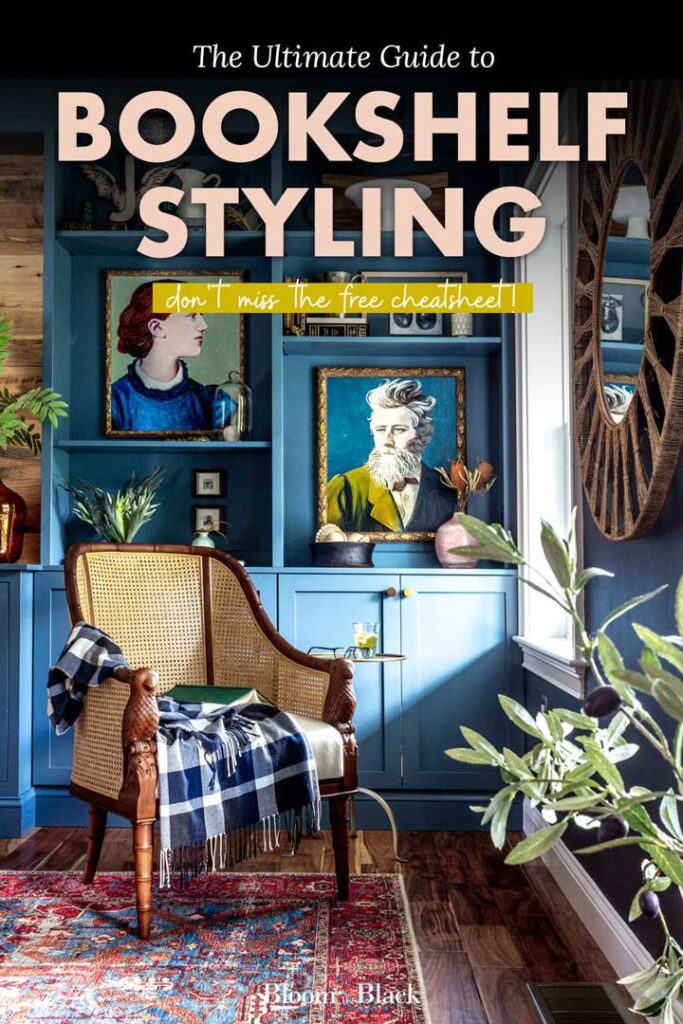
How to Decorate a Bookshelf (5 Simple Steps)
Like a lot of you, I have a large built-in bookcase in my new construction house. It’s a pretty common feature and one that can feel super tricky to tackle.
Have you looked at those perfectly decorated bookshelves in the Pottery Barn catalog and wondered, “How do you style a bookshelf like a pro?”
In this post, I’m going to teach you how to decorate a bookshelf in five simple steps.
Pin for later!
This post contains some affiliate links for your convenience. Click here to read my full disclosure policy. Thanks for supporting Bloom in the Black!
How to Decorate a Bookshelf
If you want to style a bookshelf like a pro, follow these five steps:
- Pick a color scheme: This will make your bookshelf look cohesive.
- Gather all your decor items: This will help you style faster.
- Experiment: This will make your decorating look considered.
- Distribute your finishes: This will make your styling look polished.
- Fill in the gaps: This will make your bookshelves feel finished.
Step 1: Pick a color scheme for your built-in
This tip alone is going to save you so. much. time. Instantly ditch items that don’t fit within your color scheme — no more agonizing over if something should stay or go! Creating a color scheme is actually pretty easy. Here’s how:
First, choose a color to jump off from.
This can be a favorite color, an accent color from an adjoining room, or picked from a piece of art you love. Basically, if you love the color, go with it.
Next, choose a color or two a few shades lighter, darker, or grayer than your jumping-off color.
This adds dimension and variety, so things don’t feel too matchy-matchy.
Then, pick one or two neutrals.
These will ground your color palette and open you up to more materials. Wood and metal objects make for great neutrals!
Finally, pick a contrasting color.
This is the color that will add that edge of excitement. So if you have a cool jumping-off color, pick a warm one, and vice versa. A quick cheat sheet to color opposites:
- Blue and orange
- Purple and yellow
- Red and green
Keep in mind that you don’t have to (and probably shouldn’t), choose the purest form of two opposing colors. For example, if vibrant red is your jumping-off color, a rich shade of olive would be a better choice than pure green. Make sense?
Step 2: Gather all your decor
Round up everything you could possibly use to decorate your bookshelf. I grabbed the big folding table we use for holidays and set out every book, object, and art piece we had for evaluation. From there, group things into categories and like colors to start to make sense of the madness.
I’m not going to lie — it’s annoying to maneuver around this setup. But… #worthit.
Beg, borrow, and steal…
…from other rooms of your house. This is likely the largest area of your home you will ever need to style, and it is much easier to redo the smaller areas around your home than to start from scratch here.
Be ruthless with your color scheme (see tip #1).
If it doesn’t fit in your scheme, it loses its spot at the table.
Take this opportunity to curate your book collection.
You don’t have to chuck your old Babysitter’s Club series or the scads of Christopher Pike books you own (I’m dating myself here…), but they don’t need to go on display either. Maybe pile those into a few decorative boxes or store them in the basement until your kids are old enough to appreciate them. Or donate them!
That said, you don’t have to stick to the purely decorative or brag-worthy — choose the few that are very special to you and display those, as well as some of the prettier ones.*
*To be fair, this curation tip falls in with how I chose to decorate. You could definitely load up all the books if that is more in line with your vibe. You gotta do you.
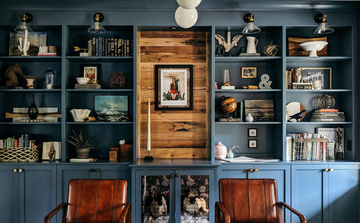
Step 3: Experiment with shelf vignettes
OK, finally! Time to start decorating that bookshelf. This is always the hardest part for me. A blank slate is super intimidating, so you gotta dive in and know that you’ll be rearranging all of this a few times before you’re happy with the result. Nothing is set in stone!
Give yourself permission to try different things, even if you’re pretty sure it won’t work. For example, I thought it might be cool to add some bands of texture by adjusting some of the shelves closer together and stuffing them full of small paperbacks flipped spines in. It was a neat idea, but I wasn’t feeling it, so I moved on. No biggie! Here are some things to keep in mind:
Start with the basics.
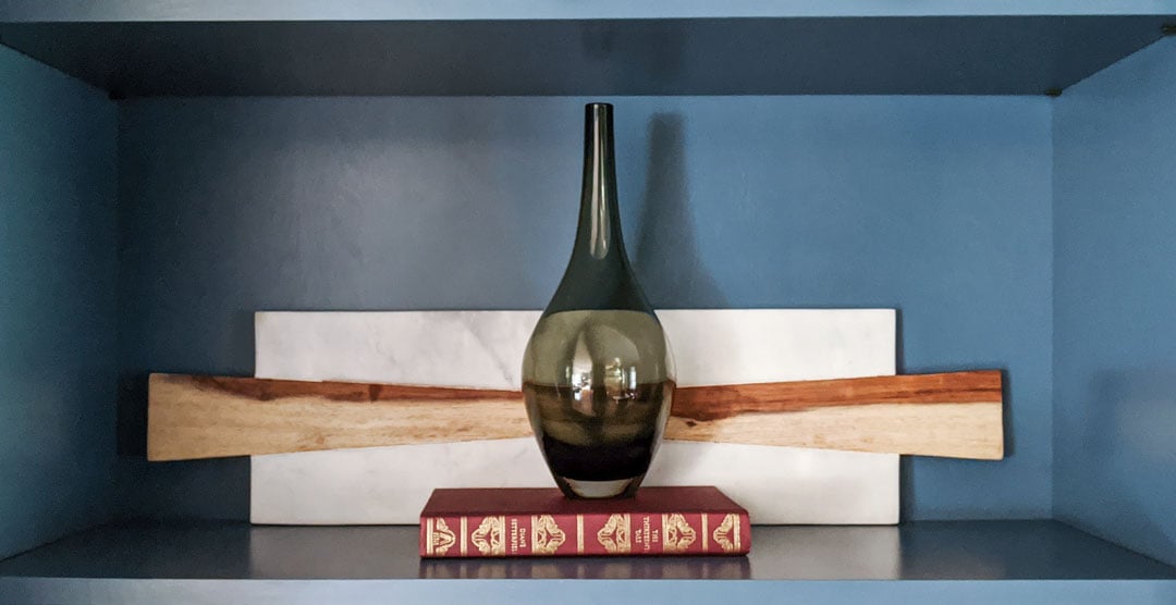
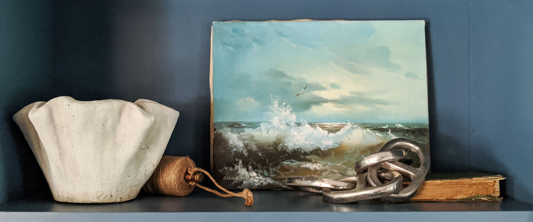
On each shelf, use something vertical, something horizontal, and tie those planes together with a round or organic shape. For example, you could place a few books alongside one another for your vertical element, a tray as your horizontal element, and a cool sculpture as your organic element.
Still stuck? I made a free cheatsheet of shelf vignettes for you to copy!
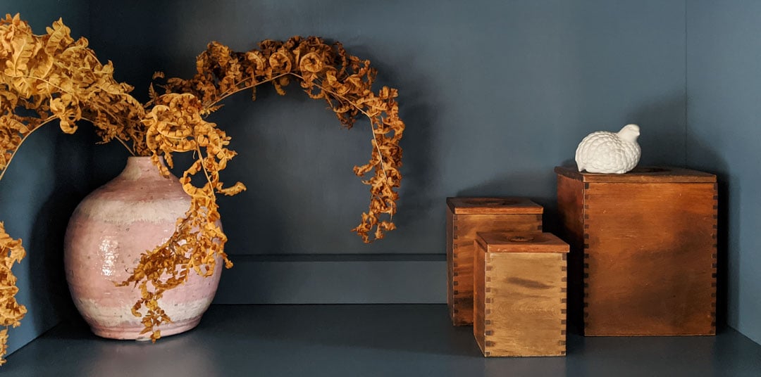
Use an odd number of objects in each vignette.
Have you heard of the magic rule of three? It’s spot on — the eye likes odd numbers. Bear in mind that a united group will read as one object. Like a group of bud vases on a horizontal book or a candle sitting on top of a pedestal equals one “object.”
Vary the heights and sizes of your objects.
In general, you want to lead the eye around your styled vignettes by varying the height and visual weight of the pieces you use. If you put a vase and a sculpture next to one another and they are roughly the same size, it will feel off. Pair your items with things that are significantly taller, shorter, wider, etc., and you’ll have a much more harmonious grouping.
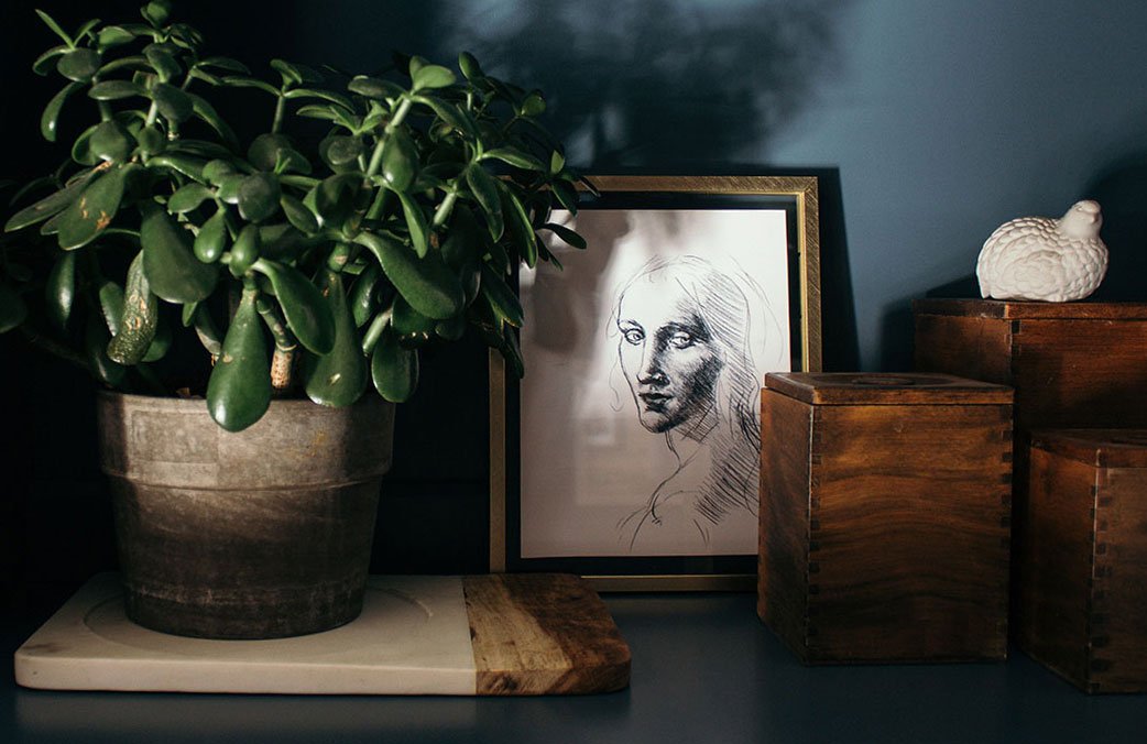
Vary the texture and sheen of your objects.
Don’t get stuck on one note when it comes to the materials you use. All dull, all shiny, all clear, all metal, all wood… you get the picture. You might have a strong preference for metallic objects, but if everything you use is metallic, you will a.) blind your family and friends and b.) camouflage all the special stuff since everything looks the same.*
*The exception to this tip is if you have a special collection that you can display en masse and not just a few pieces, then the continuity works in your favor.
Add depth.
Don’t just put a bunch of things in a row on the same plane (like along the middle of the shelf). Be sure to put objects behind and in front of one another. Try hanging a picture on the back of the shelf and placing a few of your antique thimbles at the front. Or, you know, whatever little things you have if you aren’t super into thimbles…
Take photos of the shelves you like.
You might need or want to move one vignette to a different shelf, and trying to recreate that from memory is the worst. Been there, done that, don’t recommend it.
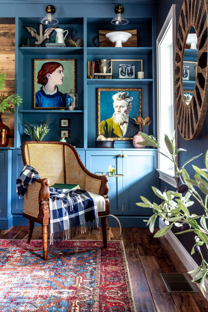
Step 4: Distribute your shelf decor evenly
Now that you have some styled shelves that are working, take a step back and see if the whole thing feels balanced. Is one side tightly packed with the other wide and airy? Do you see any colors bunching up? How about materials? This is where those photos will come in handy because it’s time to move things around…
Do you want your shelves all very full, all fairly sparse, or an even mix of the two?
If your plan is to decorate all your shelves to have the same amount of “stuff” in each, your job is a bit easier. Just eyeball everything from afar and be sure there are no uneven spots. Squinting can help you see the mass rather than the individual things in this step.
If you want to create a mix, I find it helpful to do a shelf on one side, then an equally full (or sparse) shelf on the opposite side. Ended up with three full shelves clumped in a corner? Pull one down and recreate it in a more appropriate spot referencing the photos you took. Then place an airy vignette in its place.
Spread your colors, materials, and dominant shapes around equally.
Step back again to evaluate. This time, take note of any colors that are dominating one area, especially if it’s a color that stands out. In my case, I have a dark bookcase, so the whites are like little beacons to the eye. Because of this, I paid extra attention to sprinkling the white pieces around evenly. Receding colors like blues and greens are a bit more forgiving.
Follow this same process to evaluate and distribute first your materials, then your shapes. I have a lot of round objects, so I was careful to repeat them deliberately throughout.
Step 5: Fill in the gaps
It’s inevitable — you’re going to have gaps. I was actually a little surprised by this, but honestly? Even if you have a lot of stuff, not all of it is going to work. What’s a girl to do but go shopping?
There’s always the small issue of budget of course, so here are a few places I found some awesome deals:
Thrift stores, antique malls, and yard sales.
Decorating a bookshelf is the perfect excuse to buy that weird little tchotchke you never knew you always wanted. Thrifting can be seriously overwhelming, though.
Before you go, jot down any materials, textures, or colors you might need more of. Bring your list, put on your blinders, and take some more photos of your in-progress shelves to reference while you are debating between the set of antique croquet balls that might work in that cool bowl on the third shelf to the left or the vintage yet modern brass candlesticks screaming your name.
The clearance section of your favorite off-price retailer.
I scored huge at my local HomeGoods. While this isn’t typically where I’d go for any core pieces, it’s a gold mine when you need a supporting cast for large decorating projects. Same rules apply here — bring your list, photos, and blinders.
Unless you spot an amazing Le Creuset pot on sale. Then, by all means…
Your favorite big box or large chain store.
Target is a no-brainer here. The constant rotation of on-trend pieces makes this a great place to find seasonal fill-ins as well as some of the more permanent additions. Another great place that I always forget about but am so happy when I remember it again is H&M! The pieces are surprisingly chic for the price point. And, of course, IKEA. Enough said.
Listen, I know this seems like a lot, but YOU’VE GOT THIS. Follow the steps, take your time, and get ready for the compliments to start rolling in 🙂
Want more? Shop my bookshelf decor on Amazon for a curated collection of perfect shelf-styling objects.